Context
PayPal is Transforming it's core Value Propositions
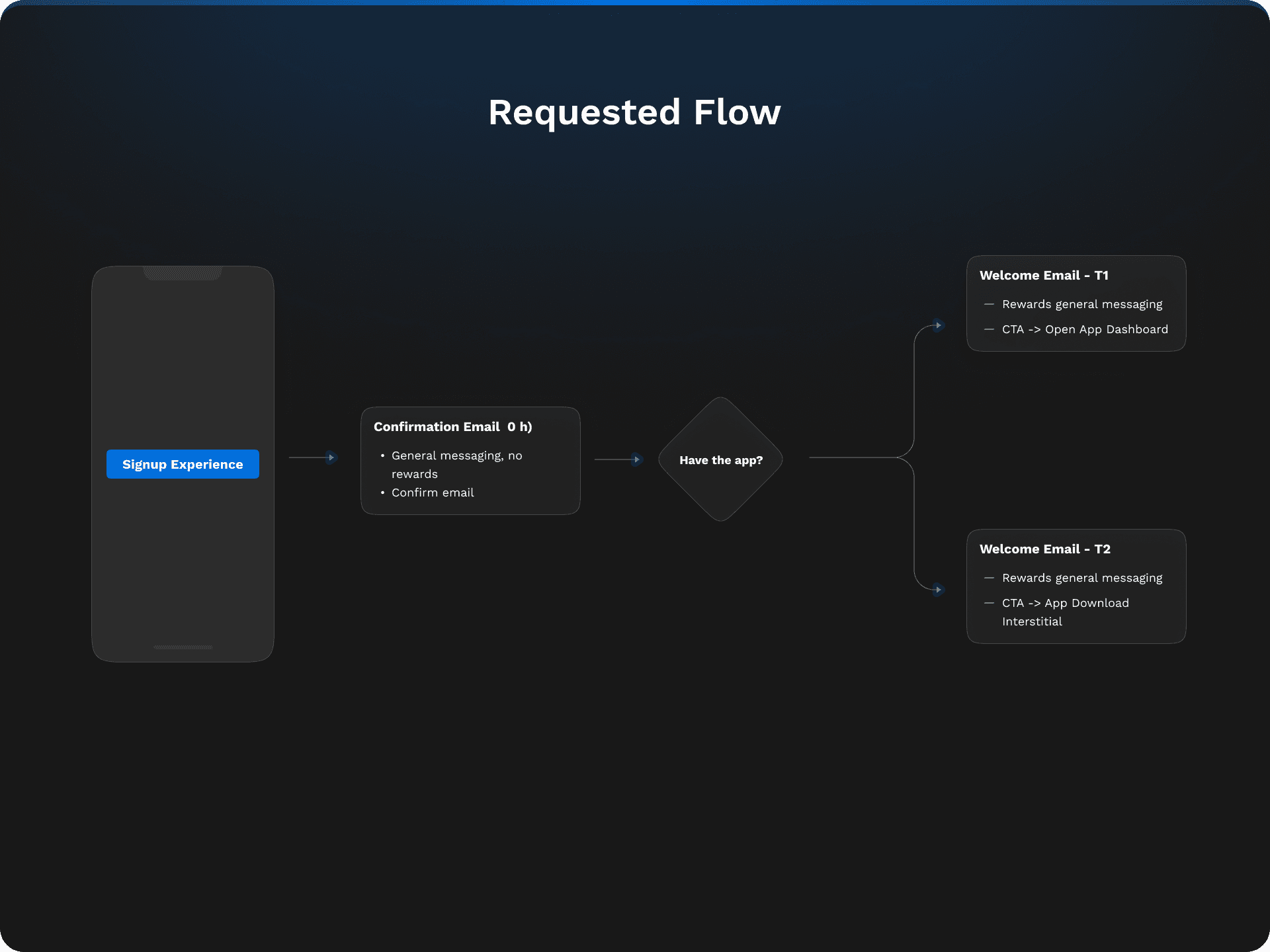
PayPal's initial user communications, such as confirmation and welcome emails, were significantly out of step with the brand's evolution and new rewards system, they were not aware of the new value props. With engagement rates highlighting their importance—50% of new signups engage with the welcome email, impacting millions annually—the need for a redesign was clear.
Revise welcome experience flow and confirmation emails and notifications to highlight new rewards and improve user engagement and app interactions, using an updated 2024 UI design. We want users to start using the app and know about the rewards system right of the bat.
A new welcome experience flow was designed to educate users along their first touchpoints about the new Paypal. A first iteration was launched to the global market and it's currently live. The foundation for next steps and email personalization was set.
Focused on Safety
Fast Payments
P2P Transactions

Focused on Rewards
Cashback & Shopping
Exciting ways to earn
Fastest & Easiest Payments
Creating a New Paypal
Metrics
KPI's
How many users finish the flow and activate.
% of users who perfom a second action at the app.
% Of users who inititate the welcome journey.
Ratio of clicks on the actions of the welcome journey,
Downstream Metrics
% of offers saved of activated users.
Methodology
Double Diamond + Design Thinking

Empathizing with New Users
Understanding where new users come from & Intentions
The user is shopping and creates an account through checkout.
Implicit intention in shopping and secure payments.
They could be interested in rewards and introduce to them cashback options.
User is receiving a P2P transaction and hasn't created an account.
They are probably going to be receiving payments.
They could be interested in sending or receiving more payments, and using that money directly.
They directly entered the app
Could be curious about the different things Paypal could offer.
They could be interested in the multiple offerings of the new Paypal experience.
Define
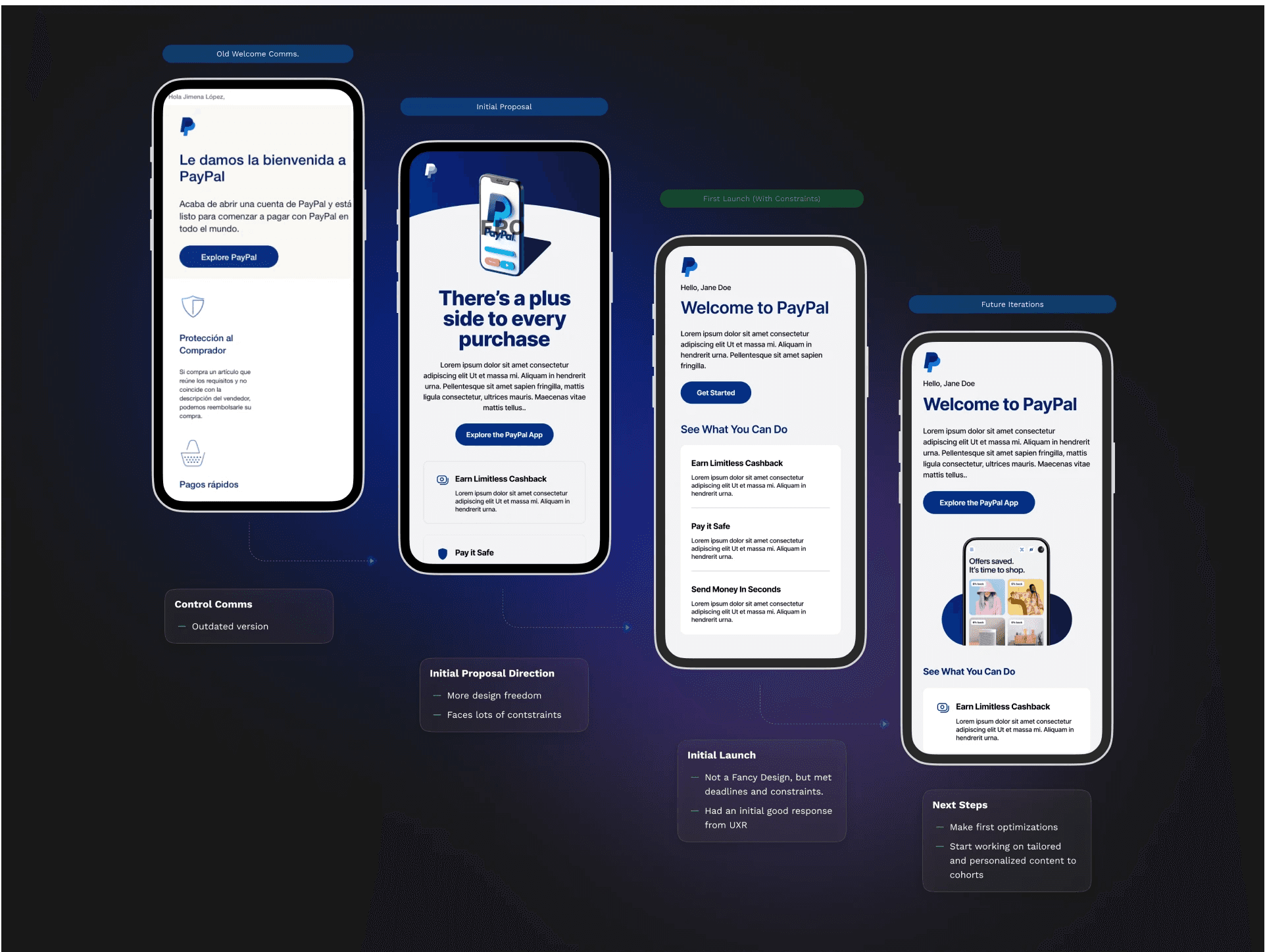
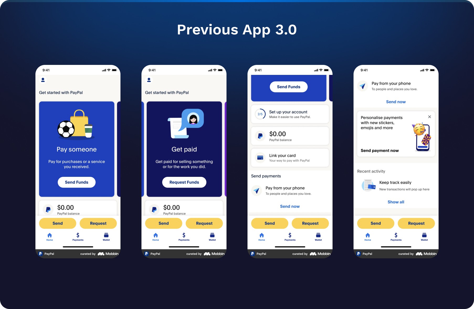
Previous Welcome Experience Flow
No personalization
Vanilla content
Old value propositions
Lack of consistency with the new 4.0 design

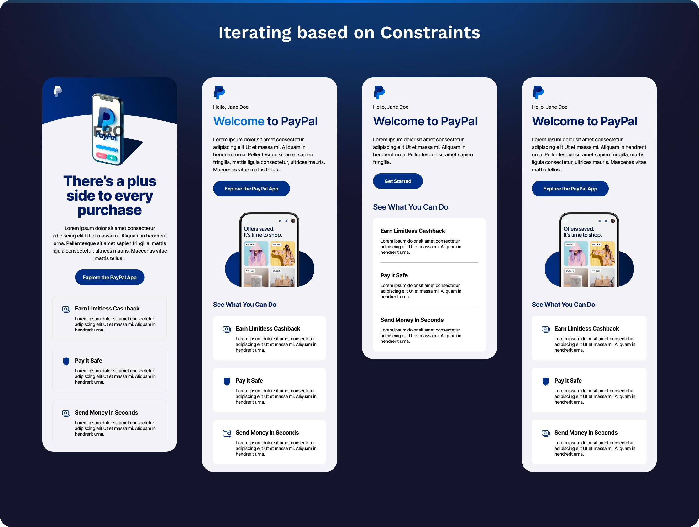
Proposed Flow & Northstar Vision
Personalization
Understanding User Context and Intent
Updated to the 4.0 PayPal Design system

Ideation
Note:
These are represntations of a few of the iterations and ideas presented to the Paypal Leadership team.
The rest of designs and mocks are property of paypal
Leadership Review
Newly found constraints
Prototype

Note:
The 3rd Design was prototyped and tested
The full prototype flow is property of PayPal
User Tests & Findings
Driving Research to Validate Our Approach
Understanding user expectations was crucial for delivering a relevant experience. I spearheaded the user research efforts, organizing the study brief and getting a readouts by my UXR partner in 2 weeks. This proactive approach allowed us to test our hypotheses and assumptions, aiming to significantly enhance activation rates.
Research Readout & Main Insights:
Initial Launch
Initial information was lacking, are there email guidelines, legal constraints, or marketing? Alongside my content partner, we kicked off an initial strategy with the limited information and interpretation of the scenario. The deadline was tight.

Note:
The 3rd Design Porotyped was tested and Launched
It's currently live for the US market and other countries worldwide.
Project Takeaways
We adapt to limitations to create the best possible experience. For major beneficial changes, we escalate to leadership. This ensures the project progresses effectively, integrating content strategy and technical feasibility from the start.
This user-centered feedback loop helped us ensure that our communications were not only visually appealing but also effectively met user needs and expectations.
It ensured that the project was progressing holistically — effectively accounting for content strategy and technical feasibility early.