Docelete
Docelete
Docelete

My Role:
My Role:
My Role:
Product Design, User Flows, User Research
Product Design, User Flows, User Research
Team:
Team:
Team:
Peter Borojevic & Jimena López
Peter Borojevic & Jimena López
Timeline:
Timeline:
Timeline:
2 Months, 40h
2 Months, 40h
Overview
Overview
Overview
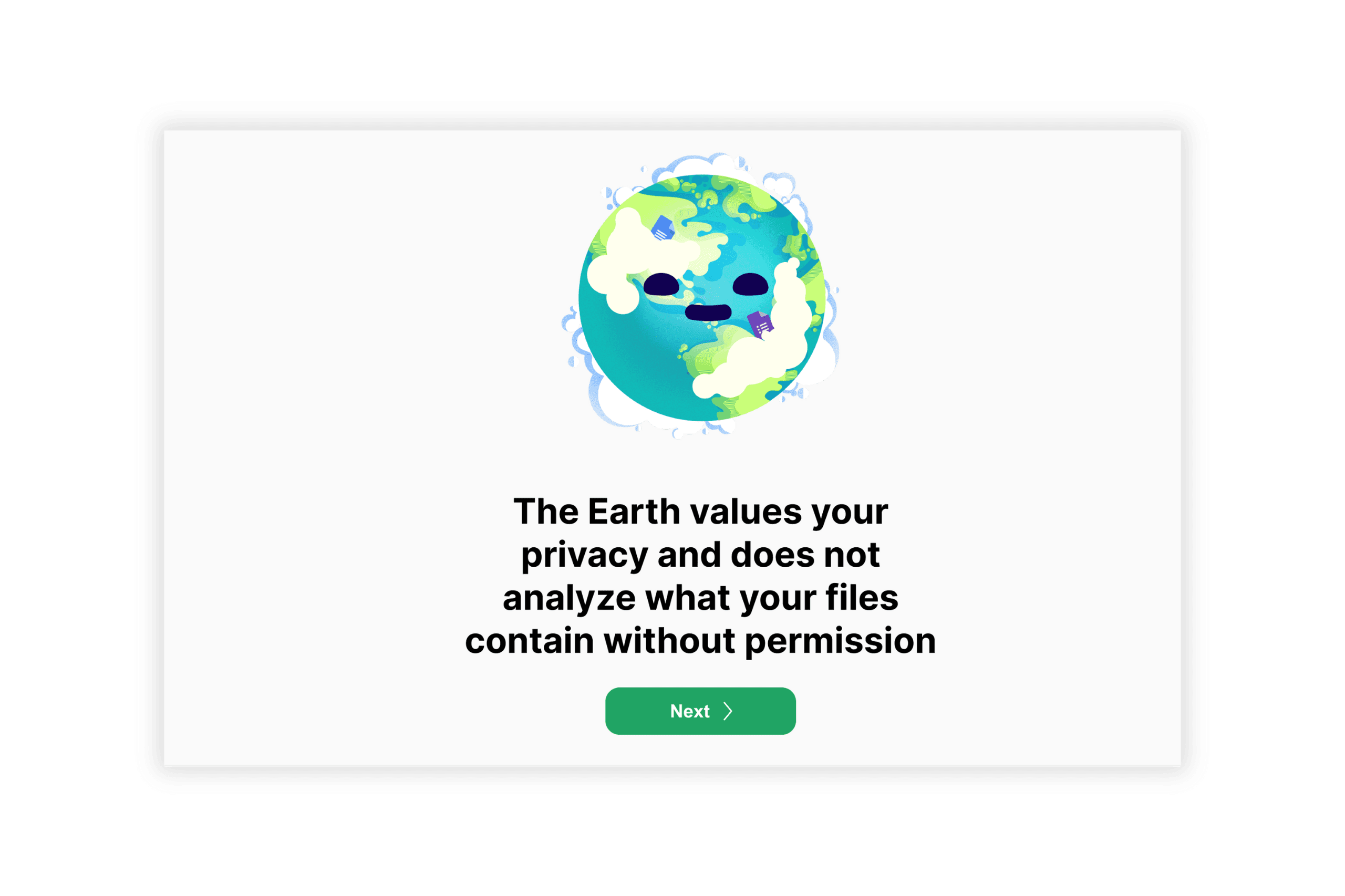
In the Master's course on User Experience Design & Evaluation, the capstone project challenged us to enhance user experiences by addressing the issue of "dark data"—the vast quantities of unutilized information consuming energy and resources unnecessarily. We designed Docelete, a plugin, during my time at KTH Stockholm, Sweden. Docelete aims to transform file deletion into an engaging and meaningful activity. It not only simplifies the process of managing digital clutter but also educates users about the importance of sustainable cloud usage. We sought to directly confront the issue of dark data, proposing a solution that encourages more responsible digital behavior. This project allowed me to apply a comprehensive design approach, from identifying user needs and pain points through research, to prototyping and user testing, ultimately refining a tool that marries functionality with sustainability.
In the Master's course on User Experience Design & Evaluation, the capstone project challenged us to enhance user experiences by addressing the issue of "dark data"—the vast quantities of unutilized information consuming energy and resources unnecessarily. We designed Docelete, a plugin, during my time at KTH Stockholm, Sweden. Docelete aims to transform file deletion into an engaging and meaningful activity. It not only simplifies the process of managing digital clutter but also educates users about the importance of sustainable cloud usage. We sought to directly confront the issue of dark data, proposing a solution that encourages more responsible digital behavior. This project allowed me to apply a comprehensive design approach, from identifying user needs and pain points through research, to prototyping and user testing, ultimately refining a tool that marries functionality with sustainability.
In the Master's course on User Experience Design & Evaluation, the capstone project challenged us to enhance user experiences by addressing the issue of "dark data"—the vast quantities of unutilized information consuming energy and resources unnecessarily. We designed Docelete, a plugin, during my time at KTH Stockholm, Sweden. Docelete aims to transform file deletion into an engaging and meaningful activity. It not only simplifies the process of managing digital clutter but also educates users about the importance of sustainable cloud usage. We sought to directly confront the issue of dark data, proposing a solution that encourages more responsible digital behavior. This project allowed me to apply a comprehensive design approach, from identifying user needs and pain points through research, to prototyping and user testing, ultimately refining a tool that marries functionality with sustainability.
Context
PayPal is Transforming it's core Value Propositions
The Problem
The Problem
PayPal's initial user communications, such as confirmation and welcome emails, were significantly out of step with the brand's evolution and new rewards system, they were not aware of the new value props. With engagement rates highlighting their importance—50% of new signups engage with the welcome email, impacting millions annually—the need for a redesign was clear.
Objective
Objective
Revise welcome experience flow and confirmation emails and notifications to highlight new rewards and improve user engagement and app interactions, using an updated 2024 UI design. We want users to start using the app and know about the rewards system right of the bat.
Solution
Solution
A new welcome experience flow was designed to educate users along their first touchpoints about the new Paypal. A first iteration was launched to the global market and it's currently live. The foundation for next steps and email personalization was set.
Focused on Safety
Fast Payments
P2P Transactions

Focused on Rewards
Cashback & Shopping
Exciting ways to earn
Fastest & Easiest Payments
Creating a New Paypal
Metrics
KPI's
Activation Rates
Activation Rates
How many users finish the flow and activate.
Reengagement Rates
Reengagement Rates
% of users who perfom a second action at the app.
Open Rates
Open Rates
% Of users who inititate the welcome journey.
CTR ( Click through rates)
CTR ( Click through rates)
Ratio of clicks on the actions of the welcome journey,
Downstream Metrics
Offers Saved
Offers Saved
% of offers saved of activated users.
Weekly Login
Weekly Login
Average weekly login's per activated user.
Weekly Login
Average weekly login's per activated user.
Methodology
Double Diamond + Design Thinking

Empathizing with New Users
Understanding where new users come from & Intentions
Checkout
Checkout
The user is shopping and creates an account through checkout.
Implicit intention in shopping and secure payments.
They could be interested in rewards and introduce to them cashback options.
P2P Transaction
P2P Transaction
User is receiving a P2P transaction and hasn't created an account.
They are probably going to be receiving payments.
They could be interested in sending or receiving more payments, and using that money directly.
PayPal.com or App
PayPal.com or App
They directly entered the app
Could be curious about the different things Paypal could offer.
They could be interested in the multiple offerings of the new Paypal experience.
Define
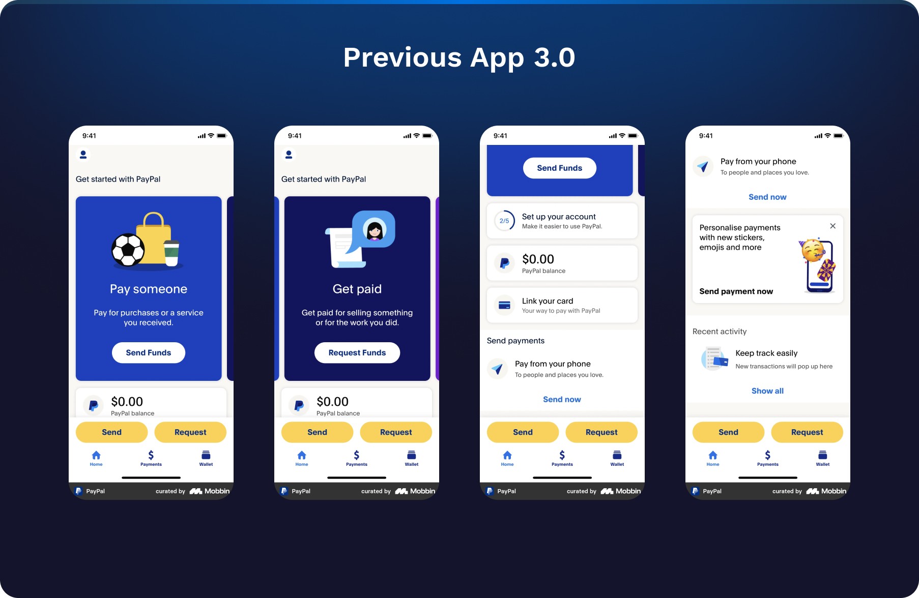
Previous Welcome Experience Flow
No personalization
Vanilla content
Old value propositions
Lack of consistency with the new 4.0 design
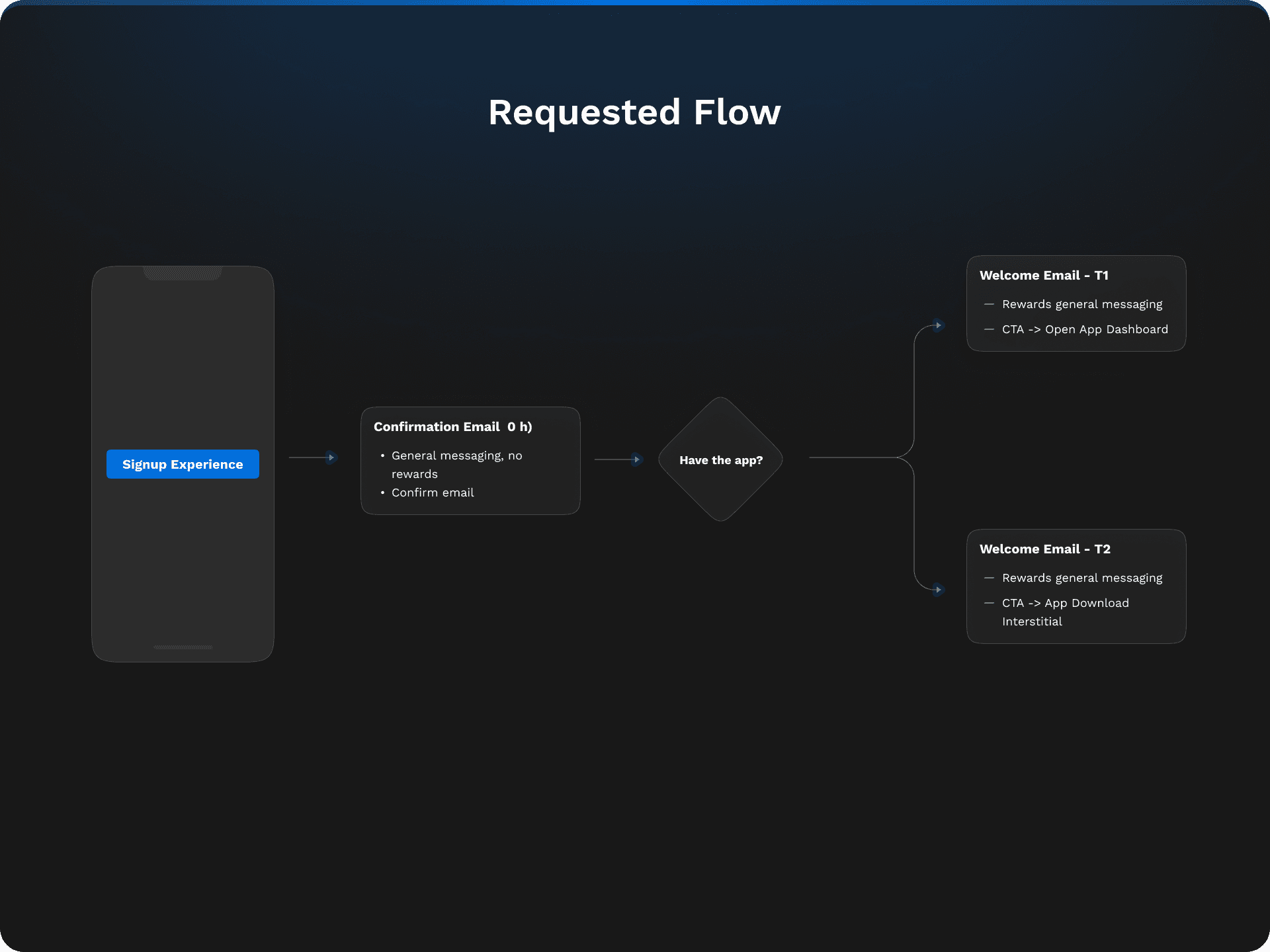

Proposed Flow & Northstar Vision
Personalization
Understanding User Context and Intent
Updated to the 4.0 PayPal Design system

Ideation
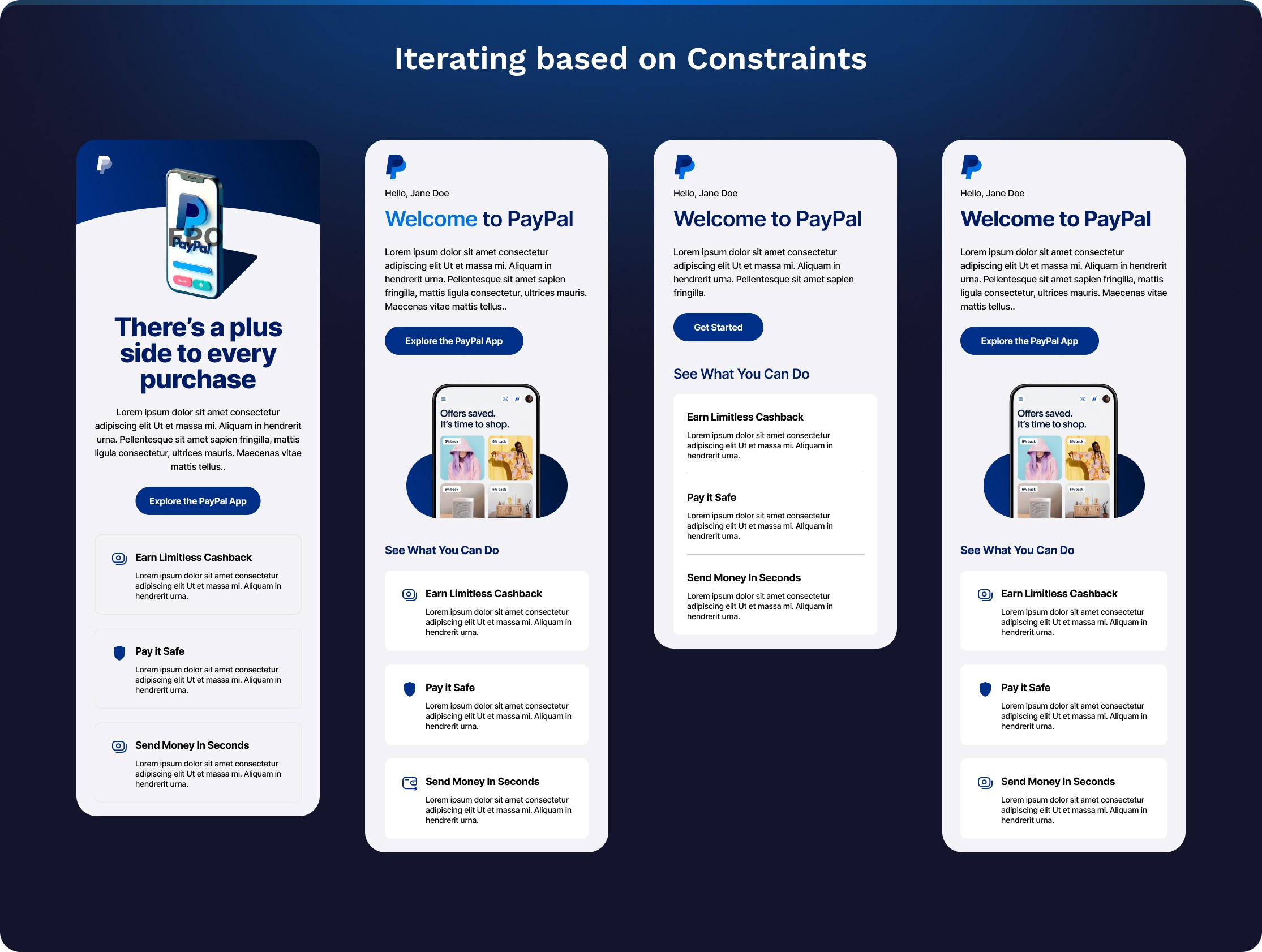
Note:
These are represntations of a few of the iterations and ideas presented to the Paypal Leadership team.
The rest of designs and mocks are property of paypal
Leadership Review
Newly found constraints
The initial designs, while fresh and modern, prompted valuable feedback from leadership, highlighting the need for clearer calls to action and considerations of legal constraints.
The initial designs, while fresh and modern, prompted valuable feedback from leadership, highlighting the need for clearer calls to action and considerations of legal constraints.
Inflexible system templates limited design possibilities.
Inflexible system templates limited design possibilities.
Legal constraints on wording to avoid being flagged as marketing
Legal constraints on wording to avoid being flagged as marketing
A shortage of approved assets, such as illustrations or images, for early life communications.
A shortage of approved assets, such as illustrations or images, for early life communications.
Prototype

Note:
The 3rd Design was prototyped and tested
The full prototype flow is property of PayPal
User Tests & Findings
Driving Research to Validate Our Approach
Understanding user expectations was crucial for delivering a relevant experience. I spearheaded the user research efforts, organizing the study brief and getting a readouts by my UXR partner in 2 weeks. This proactive approach allowed us to test our hypotheses and assumptions, aiming to significantly enhance activation rates.
Research Readout & Main Insights:
Strong comprehension of benefits
Strong comprehension of benefits
Users were excited to learn about cash back and the newer value props. They clearly understood the benefits.
Users were excited to learn about cash back and the newer value props. They clearly understood the benefits.
Positive response to tone, design & friendliness.
Positive response to tone, design & friendliness.
Participants described the email tone as informative, friendly, and welcoming. Did not feel pushy or spammy.
Participants described the email tone as informative, friendly, and welcoming. Did not feel pushy or spammy.
What is the benefit of the app?
What is the benefit of the app?
There was a disconnect between the value props stated in the email and the app, users didn't what they were getting by downloading.
There was a disconnect between the value props stated in the email and the app, users didn't what they were getting by downloading.
Too Many Steps To Activate
Too Many Steps To Activate
Users were not expected to be taken to either the app or to download it. The expectations set were not clear enough.
Users were not expected to be taken to either the app or to download it. The expectations set were not clear enough.
Initial Launch
Continous Improvement Approach
Continous Improvement Approach
Initial information was lacking, are there email guidelines, legal constraints, or marketing? Alongside my content partner, we kicked off an initial strategy with the limited information and interpretation of the scenario. The deadline was tight.

Note:
The 3rd Design Porotyped was tested and Launched
It's currently live for the US market and other countries worldwide.
Project Takeaways
Navigating Constraints with Agile Solutions
Navigating Constraints with Agile Solutions
We adapt to limitations to create the best possible experience. For major beneficial changes, we escalate to leadership. This ensures the project progresses effectively, integrating content strategy and technical feasibility from the start.
User-Centric Approach to Product Development
User-Centric Approach to Product Development
This user-centered feedback loop helped us ensure that our communications were not only visually appealing but also effectively met user needs and expectations.
Involve cross-functional partners from the beginning
Involve cross-functional partners from the beginning
It ensured that the project was progressing holistically — effectively accounting for content strategy and technical feasibility early.
The Challenge
“¿How can we design a user experience that facilitates the direction of more sustainable management of the data and less dark data?”
“¿How can we design a user experience that facilitates the direction of more sustainable management of the data and less dark data?”
“¿How can we design a user experience that facilitates the direction of more sustainable management of the data and less dark data?”
“¿How can we design a user experience that facilitates the direction of more sustainable management of the data and less dark data?”
Reducing The Scope
Freedom, exploration, and creativity were the goals
Freedom, exploration, and creativity were the goals
What field do we want to choose?
Who do we want to target? Why?
How are we going to bring them value
What field do we want to choose?
Who do we want to target? Why?
How are we going to bring them value
What field do we want to choose?
Who do we want to target? Why?
How are we going to bring them value

Findings
Who do we want to target?
1) Google Drive is, by far, one of the largest contributors to cloud data and a significant generator of dark data. 2) Students form a substantial user group of Google Drive, making them a potential target for our initiative.
1) Google Drive is, by far, one of the largest contributors to cloud data and a significant generator of dark data. 2) Students form a substantial user group of Google Drive, making them a potential target for our initiative.
User Personas

Emily, 22
English Literature Student
Emily, an English Literature undergrad, is deeply engaged with her studies, attending classes, group sessions, doing assignments, and participating in writing workshops. She uses cloud storage to manage her assignments, writings, and digital books, accessed mainly through her laptop and sometimes her smartphone. However, Emily faces challenges with cluttered drive storage and is concerned about the environmental impact of her digital footprint.

Alex, 25
Ms. Computer Science
Alex's daily routine involves intensive coding, data analysis, and compiling research findings, with his desktop being the core of his work and cloud storage. He struggles with managing a cluttered digital workspace and worries about the environmental impact of data centers. Motivated by efficiency and sustainability, Alex seeks methods to streamline his workflow and reduce his digital footprint's ecological impact.
Interviews
Question List
Question List
1. For how long have you approximately used Google Drive for storing files? 2. What do you primarily use Drive for? 3. How much of the content (in terms of existing files) on Drive do you utilize frequently? 4. What is your decision process to choose whether that file is necessary or unnecessary? 5. How often do you go through your old Drive files and delete them? what is the experience like? 6. What is your knowledge of the sustainability challenges of storing files on clouds like Drive?
1. For how long have you approximately used Google Drive for storing files? 2. What do you primarily use Drive for? 3. How much of the content (in terms of existing files) on Drive do you utilize frequently? 4. What is your decision process to choose whether that file is necessary or unnecessary? 5. How often do you go through your old Drive files and delete them? what is the experience like? 6. What is your knowledge of the sustainability challenges of storing files on clouds like Drive?
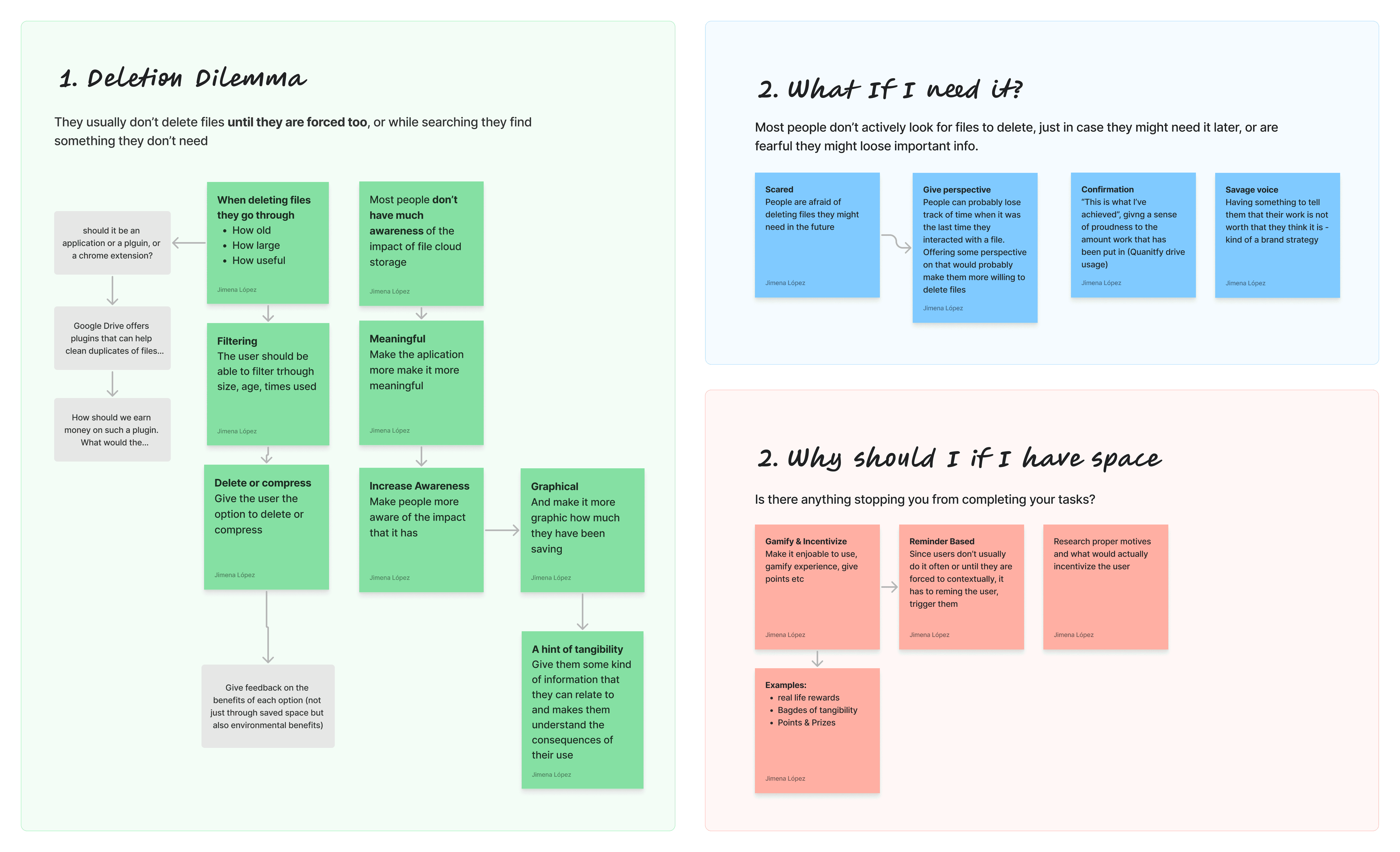
The Struggle With Deleting Files
Common Pain Points
Participants rarely deleted files
Participants rarely deleted files
Almost only did so if they ran out of storage
Almost only did so if they ran out of storage
Deletion based on their perceived usefulness
Deletion based on their perceived usefulness
How old they were, and how big they were
How old they were, and how big they were
Fear of deleting something useful
Fear of deleting something useful
There was some fear of deleting files. People never knew if they would become useful again
There was some fear of deleting files. People never knew if they would become useful again
People had a lack of awareness
People had a lack of awareness
Of how their cloud usage had an impact
Of how their cloud usage had an impact
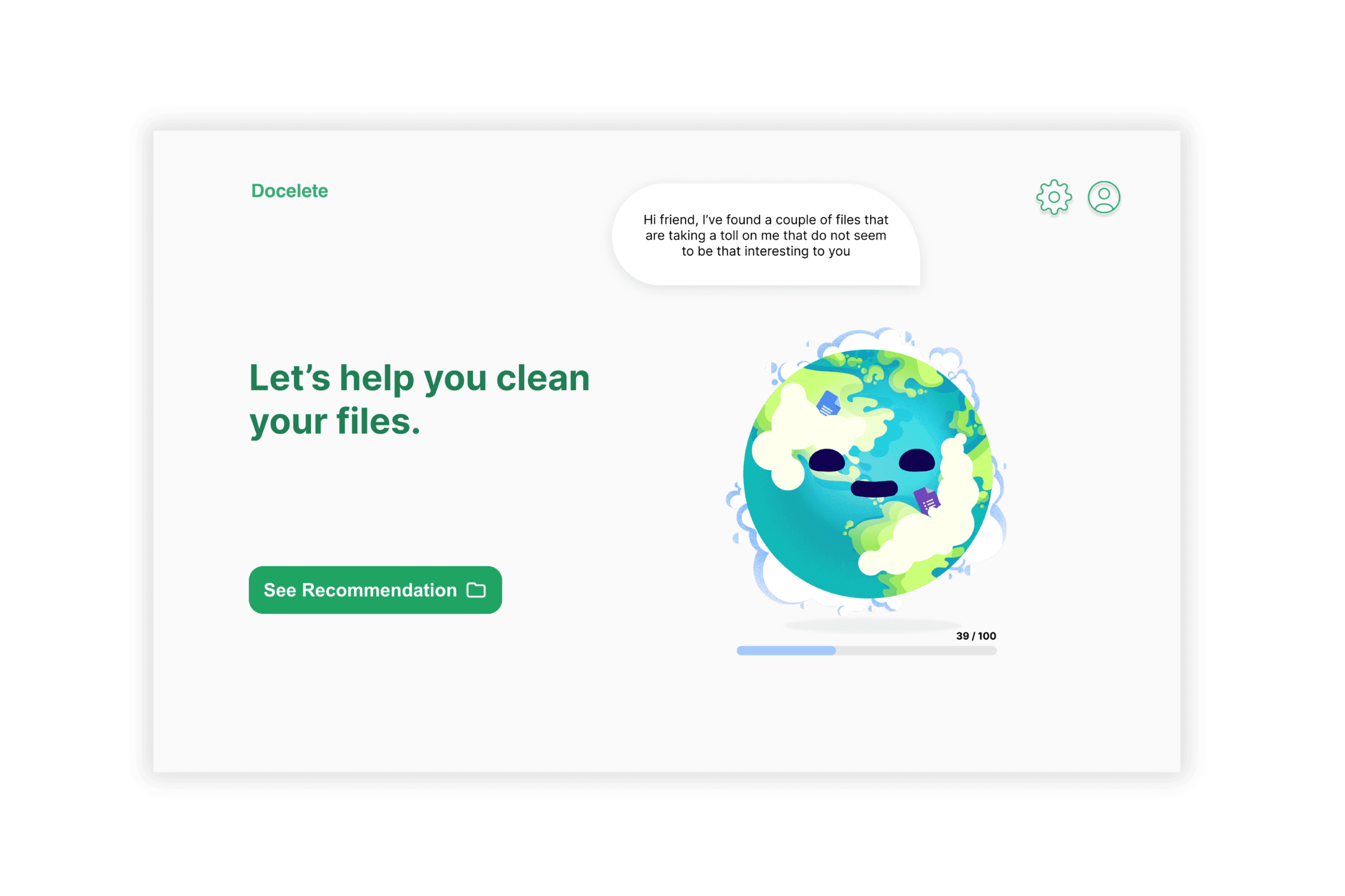
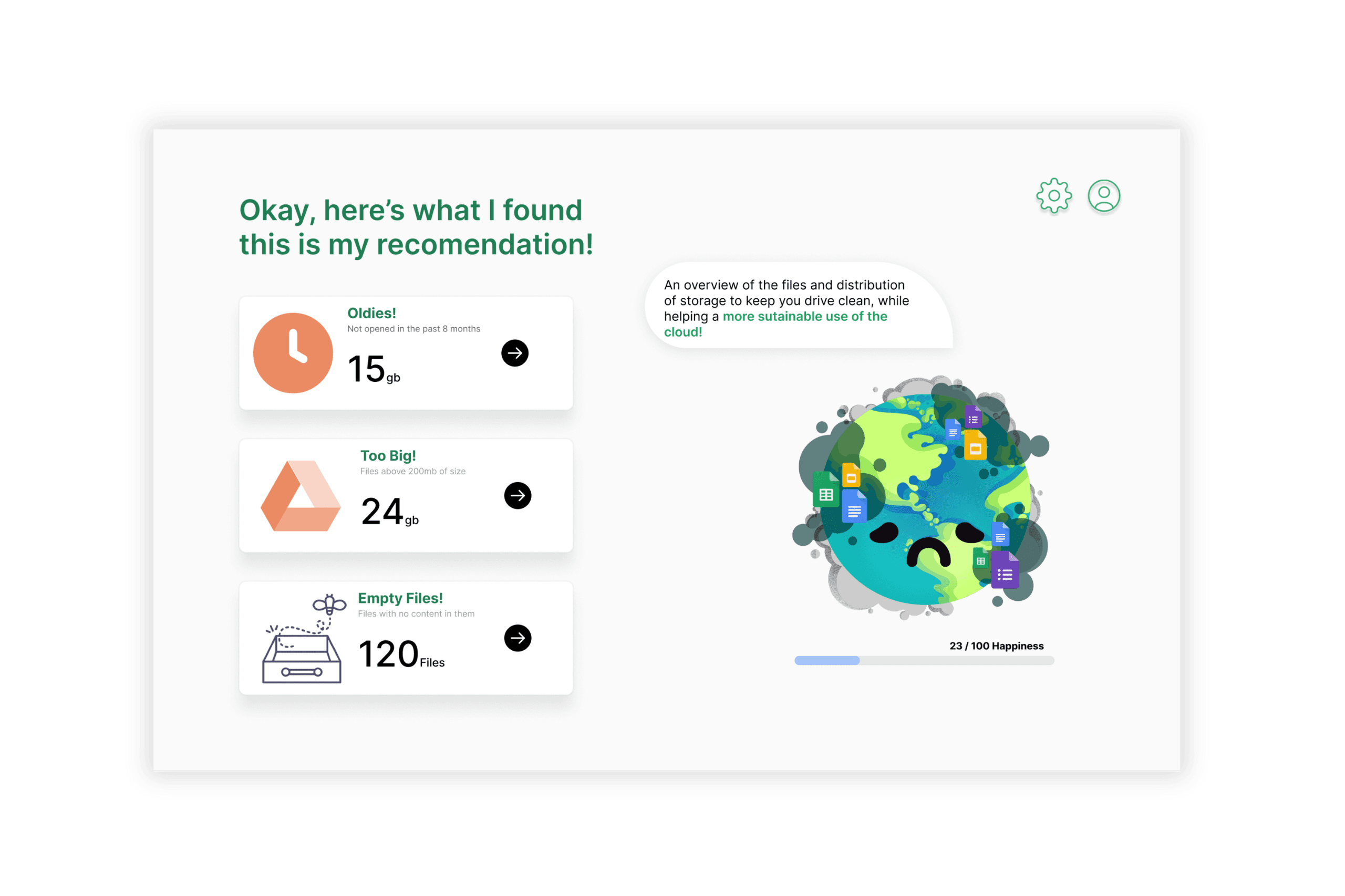
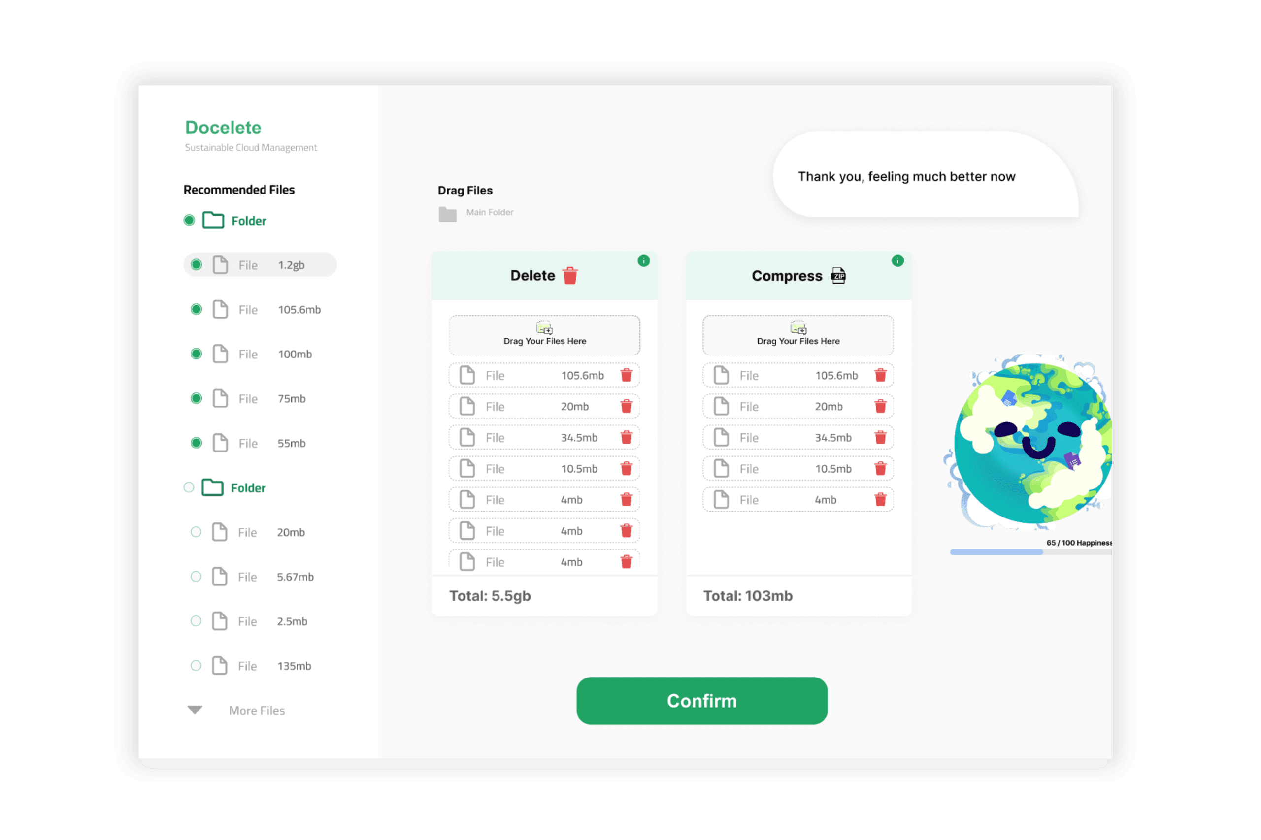
Our Main Goals
Pain Points
How can we make this rather ”Functional” Interaction more pleasurable and meaningful
Increase awareness and give a sense of reward
Brainstorming
Task Flow

Our Solution - Wireframe

Iteration 1
Comments, notes after the first LO-FI Testing:
Driving Research to Validate Our Approach
Add Metrics to how the earth is feeling
Add visible steps to the process, make steps clearer
Explain the consequences of deleting/compressing
Drag and drop would be nice
Understanding user expectations was crucial for delivering a relevant experience. I spearheaded the user research efforts, organizing the study brief and getting a readouts by my UXR partner in 2 weeks. This proactive approach allowed us to test our hypotheses and assumptions, aiming to significantly enhance activation rates.
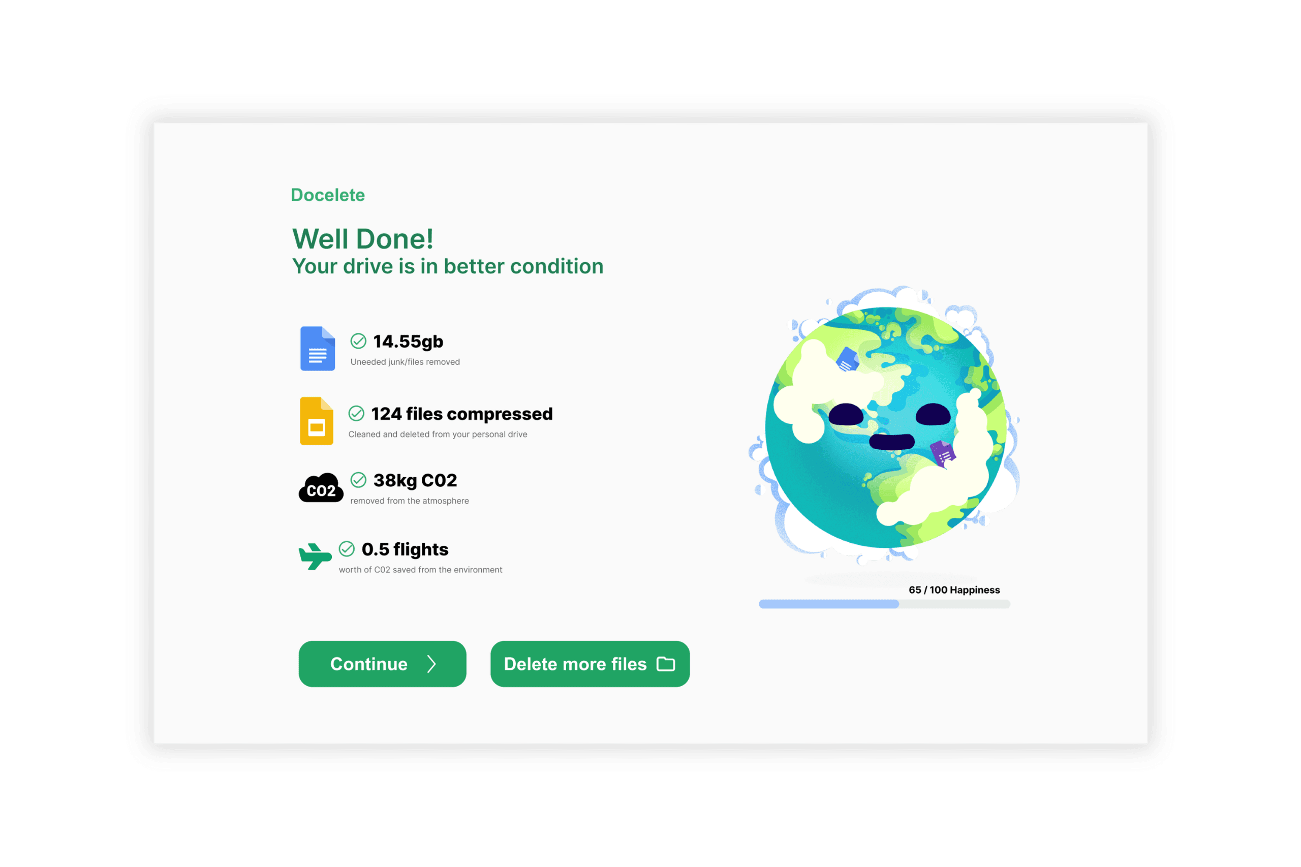
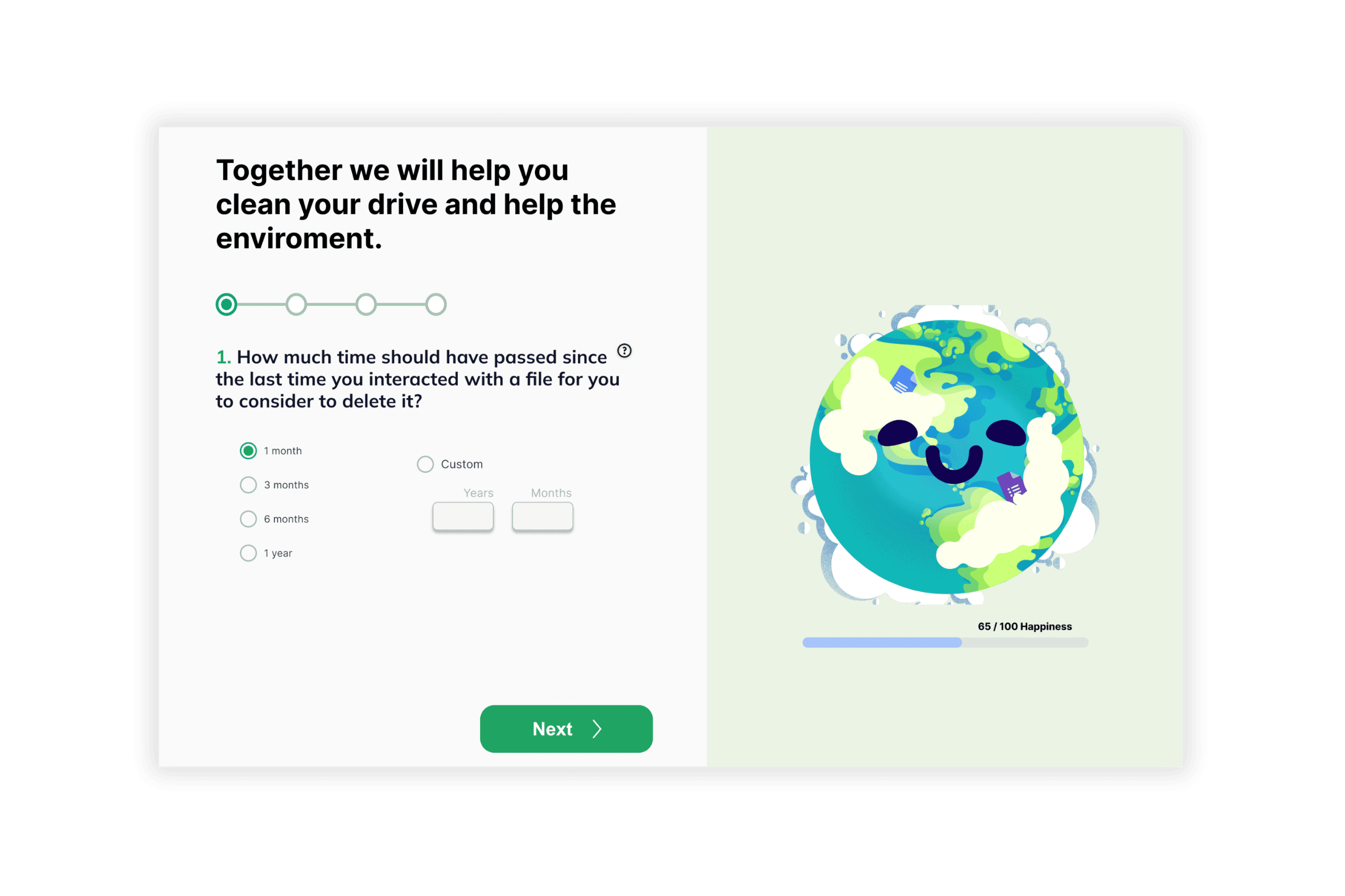
The Final Product
What would I Improve next time?
Learnings
Learnings
Iterating is key: Collecting more user feedback and brainstorming at early stages for a more refined end product.
Test Early and Constantly: To not be afraid of giving different ideas. Idea surplus is part of the process the more you have, the higher your chances of creating something more memorable.
Next steps | Improvements
Next steps | Improvements
Implement notifications and voice features into the app.
Test different avatars, companions, and other elements.
Include explanations in the file drag-and-drop menu.
Design the user profile and summary section.
Implement notifications and voice features into the app.
Test different avatars, companions, and other elements.
Include explanations in the file drag-and-drop menu.
Design the user profile and summary section.
Next Project
Next Project
Next Project
PayPal Welcome CX
PayPal Welcome CX
PayPal Welcome CX
PayPal Welcome CX
->
->
->